The Visible Spectrum
The Main Idea
This is a very basic summary, the rest of this page will go deeper.
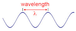
Light travels in waves like this one. Each wave will have its own wavelength, which measures the distance between two consecutive peaks of the wave.
The wavelength of the wave determines what color the light is! Larger wavelengths up to 700nm make red light, smaller wavelengths from 400nm make violet light. Nanometers are very small; there are one million nanometers (nm) in one millimeter (mm).
Note that there are only wavelegths for reds, oranges, yellows, greens, blues, and violets. Warm purples, pinks, white, and pastels do not have their own wavelengths, instead they are made up of mixtures of wavelengths.
Thats the basics, read on for more details!
Introduction to Waves and the Electromagnetic Spectrum
Almost all of these pages will rely on understanding the visible spectrum. The visible spectrum is a portion of the electromagnetic spectrum. The electromagnetic spectrum organizes particles of energy by their amount of energy and wavelengths. These particles of energy are called photons. We are familiar with many types of photons: light, heat, microwaves, radio waves, x-rays and UV-rays! Not only does light travel at the speed of light, but all photons do. One photon is the smallest unit we can separate electromagnetic energy into, we can't have fractions of photons.
Important to note is that photons travel in the form of waves.
This diagram illustrates how waves have peaks and valleys of a consistent height and distance apart. The wavelength is the distance between two peaks, an important trait to measure.
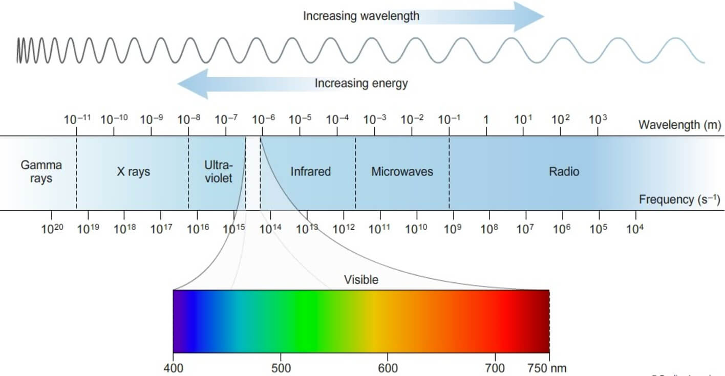
Here we see the full electromagnetic spectrum, which is organizing photons from high energy to low energy (gamma rays, x-rays, UV rays, the visible spectrum, infrared, microwaves, and radio waves). The amount of energy photons have determines their properties, hence the separation of the electromagnetic spectrum into categories. Here light is called the "visible spectrum" and heat is called "infrared radiation". Radiation may have a bad connotation, but it just means the emission of energy, which can be as harmless as heat radiating off of cooked food.
Visible light, infrared radiation, microwaves, and radio waves are forms of nonharmful radiation, as the photons do not have enough energy to break chemical bonds or ionize molecules. UV radiation, X-rays, and Gamma rays are harmful to living cells because the photons do have enough energy to cause chemical reactions. This is why you wear a lead cover when getting a dental X-ray, as X-rays can't pass through lead. The sun emits UV radiation, which is why sunscreen is important. Microwaves are typically treated as dangerous, but just as organisms will cook on a stove via intense heat, a high concentration of microwaves can also cook, this does not mean that heat or microwaves are inherently dangerous.
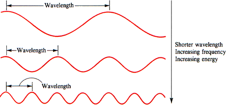
Because photons all travel at the same speed, they will cover the same amount of distance in the same amount of time, but because they have different wavelengths, there will be a different amount of wave peaks that pass that distance at a time. The shorter the wavelength, the more waves we see across the same distance or time period, meaning there is a higher frequency of waves. The longer the wavelength, the less frequent there are waves traveling across that distance. This means that frequenecy is directly proportional to energy: high frequency = high energy, low frequency = low energy.
This also means that a photon's energy is inversely proportional to its wavelength, thus if it has high energy it must have short wavelengths, and if it has low energy it has long wavelengths.
The Visible Spectrum
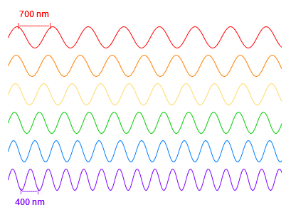
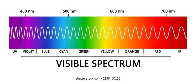
The visible spectrum is a small portion of the electromagenetic spectrum, but it encompasses all the photons we can see, which we call light. It only ranges from 400nm to 700nm (there are a million nanometers in one millimeter, so we can only see a range covering 3/10,000th of a millimeter in different wavelengths). Despite that tiny range, each wavelength is a different color of light! Light near 400nm is violet and light near 700nm is red, with the rest of the rainbow inbetween (notice how pink and white are not there).
Here are a few wavelengths representing six colors of the rainbow. Again, violet is the shortest around 400nm, and red is the longest around 700nm. Although humans like to separate rainbow colors into six or seven colors (red, orange, yellow, green, blue, purple, etc), the visible spectrum and rainbows themselves are continuous, there are no solid blocks of color, they blend into one another. Each wavelength is its own color, so while 500nm and 501nm may look indistinguishable to us, they are not the same exact color. In fact wavelengths can come in fractions unlike photons, so 600.1nm is a different color to 600.2nm.
Purple, Pink, White, and the Visible Spectrum
So where is warm purple? What about pink or magenta? Pastels? White?
These colors don't have their own wavelength, they have to be made from mixtures of wavelengths.
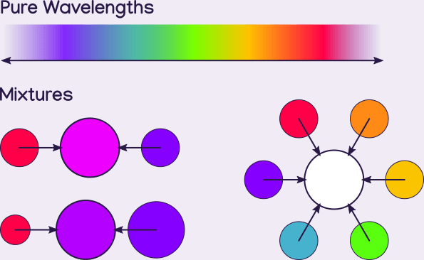
Magenta is made from equal amounts of red and violet/blue. Purple is also made from red and blue/violet, but with a higher ratio of blue/violet. White is made from all colors of the spectrum in equal amounts, although it can be reasonably approximated by as little as three colors (Red, Blue, and Green: RGB).
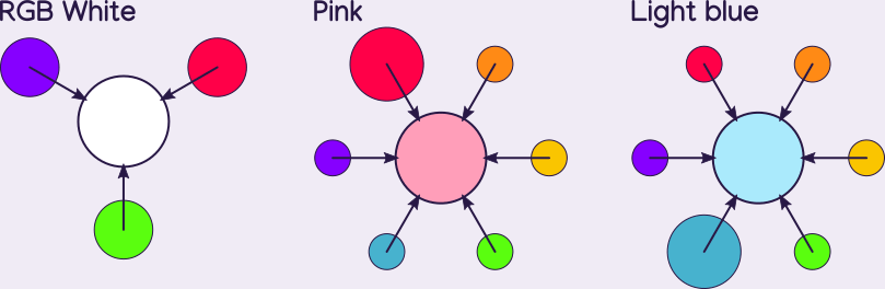
Here is white also being made by RGB, which is covered more by the primary colors page. Pink is made by mixing red and white, and because white is a mix of all colors, so is pink, just with extra red. Other pastel colors are made similarly.
Purple and Violet
So violet is a part of the visible spectrum with its own wavelengths, but purple isn't? Isn't violet purple? Confusingly, purple is a wide color category which includes both colors that are on the short end of the visible spectrum (violets) and colors that can only be made by mixing wavelengths (warm purples).
Violet is used to refer to the blue-er end of purple colors, which have their own wavelengths in the visible spectrum. To visualize the color of the smallest visible wavelength, think of the blue-ish purple light emitted by a black light. A black light emits mainly UV radiation and a little bit of visible light on the long end of UV which is violet. This violet purple is where the short end of the visible spectrum ends. Any warmer purples are created by mixing red wavelengths with blue or violet wavelengths.
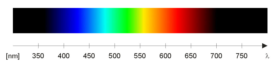
Note about Representations of the Visible Spectrum
You may have noticed that this site refers to the short end of the visible spectrum as being violet in color, but the diagram shown does not include violet, instead showing blue at 400nm.
A lot of visible spectrum diagrams online are loose illustrations and discrepancies will occur due to either simplification or misunderstanding. While the above diagram has no violet, the next diagram goes too far the other way and includes purples that are too warm to be a part of the visible spectrum.
So what does an accurate spectrum look like? Unfortunately a fully accurate diagram is impossible to display on a screen. This is because the visible spectrum contains countless wavelengths, where as a digital screen only displays three (Red, Green, and Blue) and their mixtures. Thats a simplification, the primary color page explains it more.
We see this in the first diagram, where cyan and yellow are notably lighter than the other colors. Cyan and yellow, being mixtures of light, are whiter than the primary colors that make them. Some diagrams manually reduce the brightness so that the ends are dark and the middle is the lightest which is more accurate:

In addition to adjusting the brightness, the creator was also very careful to make the red less orange, the green less lime, and the violet not too purple nor blue. Although much better, the area between blue and green is very desaturated compared to reality, though this is not the author's fault; RGB is very bad at replicating saturated teal.
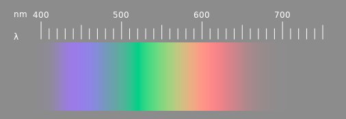
This representation makes all colors desaturated to compensate for teal and yellow either being too dull or white. It is given a grey background in attempt to make all the colors appear more saturated in comparison. This is a pretty good illustration of the visible spectrum considering the limitations of digital screens.
To observe a natural spectrum made by the sun, get a clear facetted crystal glass pendant from a craft store (sometimes found with beads) and hang it out in direct bright sunlight. It will throw little rainbows that you can study.
Suggested Next Pages: What Determines Color? Primary Colors Prisms and the Rainbow